
The complete user experience, monitoring setup, and lessons learned from building a real data platform
This is Part 2 of our Silism Commerce 360 series. If you haven’t read Part 1 about the architecture and getting started, start there →
The Streamlit Dashboard: Where Data Becomes Insights
The Streamlit interface is divided into several modules. Let’s walk through each one.
1. Executive Dashboard 📊
This is what you’d show to your CEO. High-level metrics that answer: “How’s the business doing?”
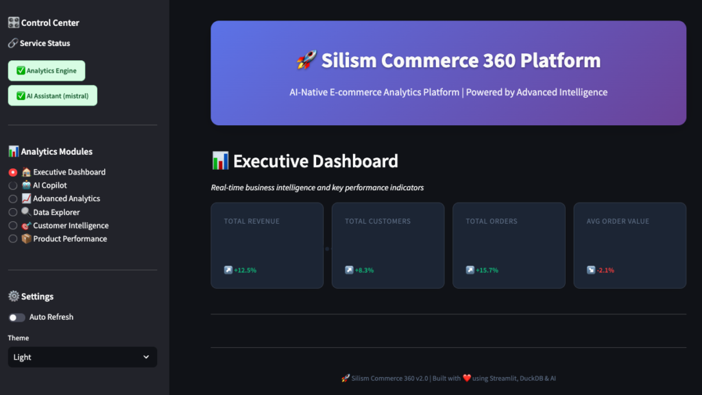
You’ll see:
- Total Revenue: All-time revenue across all orders
- Total Customers: Unique customers who’ve made purchases
- Total Orders: Number of orders placed
- Average Order Value: Revenue divided by orders
Below that, a revenue trend chart showing the last 12 months. You can hover over points to see exact values.
What’s happening behind the scenes:
-- This is what the dashboard queries
SELECT
    COUNT(DISTINCT customer_fk) as total_customers,
    SUM(total_orders) as total_orders,
    ROUND(SUM(total_revenue), 2) as total_revenue,
    ROUND(AVG(avg_order_value), 2) as avg_order_value
FROM main.fct_monthly_revenue
The dashboard hits the MCP Server, which queries DuckDB, and returns the results in milliseconds.
2. AI Copilot 🤖
This is where it gets interesting. Instead of writing SQL, you just ask questions in plain English.
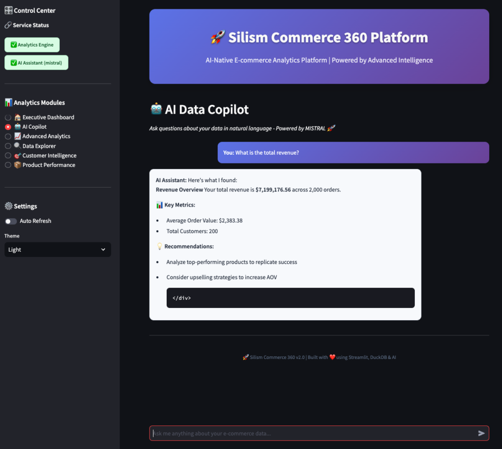
Try asking:
- “Show me the top 10 customers by revenue”
- “What’s our revenue trend over the last 6 months?”
- “Which products are performing best?”
- “How many customers are at risk of churning?”
The cool part? The AI understands your business context. It knows about customer segments, revenue metrics, and product performance because the MCP Server provides that context.
3. Advanced Analytics 📈
This module has four sub-tabs with deeper analysis.
Cohort Analysis
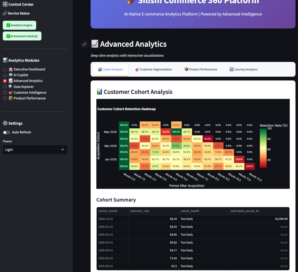
This shows customer retention by cohort (month they first purchased). Each row is a cohort, each column is months since first purchase.
- Green cells: High retention (good!)
- Yellow cells: Medium retention (watch these)
- Red cells: Low retention (problem!)
You can see patterns like:
- “Customers from January 2024 have 65% retention after 3 months”
- “Retention drops off sharply after month 6”
- “Recent cohorts are performing better than older ones”
This tells you if your product improvements and marketing are working.
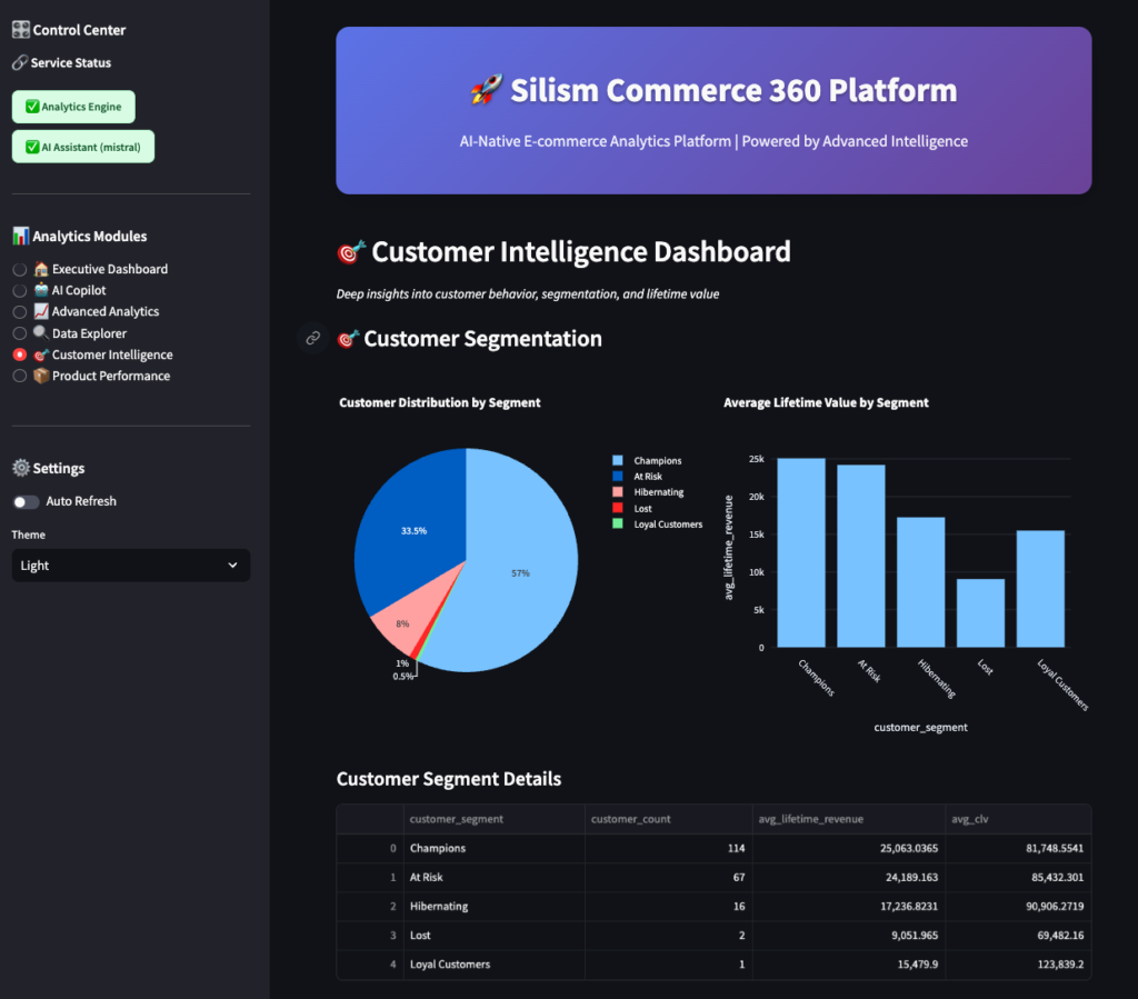
Customer Segmentation
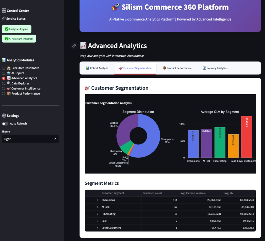
Customers are automatically segmented using RFM analysis (Recency, Frequency, Monetary):
- Champions: Best customers (recent, frequent, high-value)
- Loyal: Regular customers, good value
- At Risk: Haven’t purchased recently, but were valuable
- Lost: Haven’t purchased in a long time
The chart shows how many customers are in each segment, and the table shows metrics like average lifetime value and days since last order.
Business insight: If you see a lot of “At Risk” customers, you need re-engagement campaigns. If “Champions” are growing, your retention is working.
Product Performance
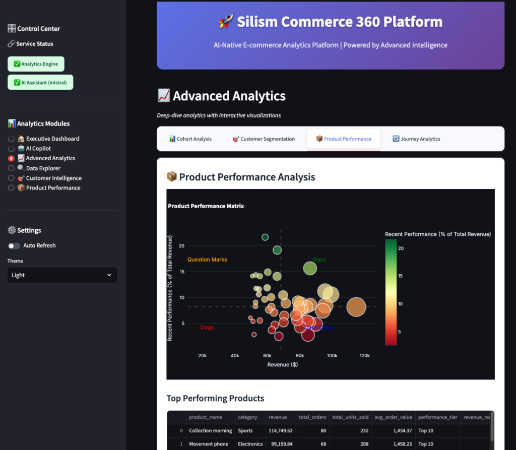
This shows:
- Top products by revenue
- Performance tiers (Star, Cash Cow, Question Mark, Dog – BCG matrix style)
- Category performance
- Products that haven’t sold recently
Use this to:
- Identify best-sellers to promote
- Find underperforming products to discount or discontinue
- Spot trends in categories
Journey Analytics
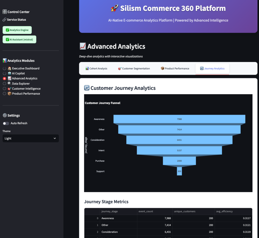
This tracks customers through their journey:
- Awareness: Page views, site visits
- Consideration: Product views, category browsing
- Purchase: Add to cart, checkout
- Retention: Repeat purchases
The funnel shows where customers drop off. If you see a big drop between “Add to Cart” and “Checkout,” you have a checkout problem.
4. Data Explorer 🔍
For when you want to write your own SQL (or just explore the data).
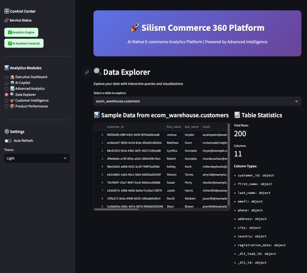
Features:
- Table browser: See all available tables
- Sample data: Preview any table
- Schema viewer: See column names and types
- SQL editor: Write custom queries
- Query examples: Pre-written queries to learn from
- CSV export: Download results
This is your power-user interface. The AI Copilot is great for quick questions, but sometimes you need to write complex queries yourself.
5. Customer Intelligence 🎯
Deep dive into customer behavior and segmentation.
Shows:
- Customer distribution by lifecycle stage (Active, At Risk, Dormant, Lost)
- Average revenue by segment
- Detailed segment metrics
- Customer value trends
Use this to:
- Identify which customers need attention
- Calculate customer lifetime value
- Plan targeted marketing campaigns
6. Product Performance 📦
Dedicated product analytics dashboard.
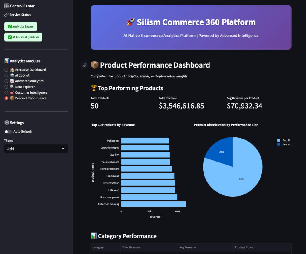
Shows:
- Top products by revenue
- Performance tier distribution
- Category performance comparison
- Detailed product metrics table
Use this to:
- Optimize inventory
- Plan promotions
- Identify product gaps
Monitoring: Keeping Everything Running Smoothly
Here’s the truth about data platforms: they break. Databases go down, pipelines fail, queries time out. The difference between a hobby project and a production system is monitoring.
Why Monitoring Matters
Imagine this scenario:
- Your data pipeline fails at 2 AM
- No one notices until 9 AM when business users complain
- You spend 2 hours figuring out what broke
- You fix it, but the morning reports are delayed
- Everyone’s mad
With proper monitoring:
- The pipeline fails at 2 AM
- You get an alert immediately (or it auto-recovers)
- You check the dashboard, see exactly what failed
- You fix it in 10 minutes
- Morning reports run on time
- You’re a hero
The Monitoring Stack
We use four main tools:
- Prometheus: Collects metrics (CPU, memory, request rates, query times)
- Grafana: Visualizes metrics in dashboards
- Loki: Aggregates logs from all services
- Jaeger: Traces requests across services
Plus Uptime Kuma for simple service health checks.
Accessing Grafana
Open http://localhost:3001 and log in with admin/admin123.
The Dashboards
Grafana comes pre-configured with several dashboards. Let’s walk through each one.
1. Data Platform Overview
This is your “mission control” dashboard. At a glance, you can see Service Health, Resource Usage …etc
2. Airflow Monitoring
This dashboard focuses on your data pipelines.
What to look for:
- DAG duration increasing: Your data is growing, or queries are slowing down
- High failure rate: Data quality issues or infrastructure problems
- Tasks stuck in queue: Not enough workers, or scheduler is slow
- Scheduler heartbeat missing: Scheduler crashed (very bad!)
Example alert: “DAG ecom_data_pipeline failed 3 times in the last hour”
3. MCP Server Monitoring
This tracks your AI/analytics service.
What to look for:
- High latency: AI model is slow, or database is overloaded
- High error rate: AI failing to generate SQL, or database errors
- Slow queries: Need to optimize SQL or add indexes
- Connection pool exhausted: Need more database connections
Example alert: “MCP Server response time p95 > 5 seconds for 5 minutes”
4. Streamlit Application
This tracks your user-facing dashboard.
What to look for:
- High page load times: Queries are slow, or too much data rendering
- Low cache hit rate: Cache not working, or too many unique queries
- Increasing memory: Memory leak in Streamlit app
- Application errors: Bugs in the code
Example alert: “Streamlit page load time p95 > 10 seconds”
Using Prometheus Directly
Sometimes you want to query metrics directly. Open http://localhost:9090.
Try these queries:
# CPU usage by service
100 - (avg by(container_name) (irate(container_cpu_usage_seconds_total[5m])) * 100)

# Memory usage by service
container_memory_usage_bytes / container_memory_max_bytes * 100

# Request rate to MCP Server
rate(http_requests_total{service="mcp-server"}[5m])

# 95th percentile response time
histogram_quantile(0.95, rate(http_request_duration_seconds_bucket[5m]))

# Error rate
rate(http_requests_total{code=~"5.."}[5m]) / rate(http_requests_total[5m]) * 100
Prometheus has a powerful query language (PromQL) for slicing and dicing metrics.
Checking Logs with Loki
When something breaks, you need logs. Open Grafana, go to “Explore,” and select “Loki” as the data source.
Try these queries:
# All logs from MCP Server
{container_name="silism-mcp-server"}

# Errors from any service
{container_name=~".+"} |= "ERROR"

# Airflow task failures
{container_name="silism-airflow-scheduler"} |= "Task failed"

# Slow queries (>1 second)
{container_name="silism-mcp-server"} |= "execution_time" | json | execution_time > 1000
Logs are structured as JSON, so you can filter by specific fields.
Distributed Tracing with Jaeger
Want to see exactly how a request flows through your system? Open http://localhost:16686.
Select a service (like mcp-server) and click “Find Traces.” You’ll see a list of requests. Click on one to see the full trace:
User Request → Streamlit → MCP Server → DuckDB
    100ms         50ms         30ms        20ms
This shows you:
- Total request time (100ms)
- Time spent in each service
- Where the bottlenecks are
If a request is slow, tracing tells you exactly which part is slow.
Service Health with Uptime Kuma
For a simple “is it up or down” view, open http://localhost:3002.
This shows:
- ✅ Service is up
- ❌ Service is down
- ⚠️ Service is slow
It also tracks uptime percentage over time.
Setting Up Alerts
Monitoring is only useful if you get notified when things break. Grafana supports alerts to:
- Slack
- PagerDuty
- Webhooks
- And many more
To set up an alert:
- Open a dashboard in Grafana
- Click on a panel (like “CPU Usage”)
- Click “Edit”
- Go to “Alert” tab
- Click “Create Alert”
- Set conditions (e.g., “CPU > 80% for 5 minutes”)
- Set notification channel (e.g., Slack)
- Save
Now you’ll get notified when CPU goes above 80% for more than 5 minutes.
Recommended alerts:
- Any service down for >1 minute (Critical)
- DAG failure (Warning)
- CPU >80% for >5 minutes (Warning)
- Disk space <20% (Warning)
- Error rate >5% for >5 minutes (Warning)
- Response time p95 >5 seconds for >5 minutes (Warning)
What I Learned Building This
Building this platform taught me a lot about what it takes to run data infrastructure in production:
1. Monitoring isn’t optional You can’t fix what you can’t see. The monitoring stack took almost as long to build as the data pipeline itself, but it’s worth it.
2. AI is powerful, but needs structure Just throwing questions at an LLM doesn’t work. The MCP Server provides structure – tools, resources, context. That’s what makes the AI Copilot actually useful.
3. DuckDB is underrated Everyone talks about Snowflake and BigQuery, but DuckDB is incredibly fast and runs anywhere. Perfect for local development and small-to-medium datasets.
4. dbt is the right abstraction Writing raw SQL scripts is fine for one-off queries, but dbt’s modularity, testing, and documentation make it the right choice for production transformations.
5. Docker makes everything easier 15+ services running with one command. No “works on my machine” problems. Docker Compose is magic.
6. Real-time + batch is the future Kafka for real-time events, scheduled pipelines for batch processing. You need both.
7. Good UX matters for data tools Data engineers often ignore UX, but a beautiful dashboard gets used. An ugly one gets ignored.
Final Thoughts
Building data platforms is hard. There are a lot of moving pieces, and things break in unexpected ways. But it’s also incredibly rewarding when everything clicks together and you can answer business questions in seconds instead of days.
This platform isn’t perfect – no platform is. But it’s a solid foundation that mirrors what you’d find at real companies. It’s production-grade without being overcomplicated.
If you’re learning data engineering, I hope this gives you a realistic view of what modern data platforms look like. If you’re an experienced engineer, I hope you find some useful patterns or tools you haven’t tried yet.
Either way, happy building! 🚀
Try It Yourself
The entire platform is open source and available on GitHub:
👉 github.com/Silism/silism-commerce-360-platform
Clone it, run it, break it, fix it, extend it. That’s how you learn.
If you build something cool with it, let me know! I’m always curious to see what people create.
← Back to Part 1: Architecture and Getting Started
Built with ❤️ by Silism — Empowering Data Teams with AI-Native Platforms
[…] 👉 Read Part 2: The Complete User Experience and Monitoring → […]